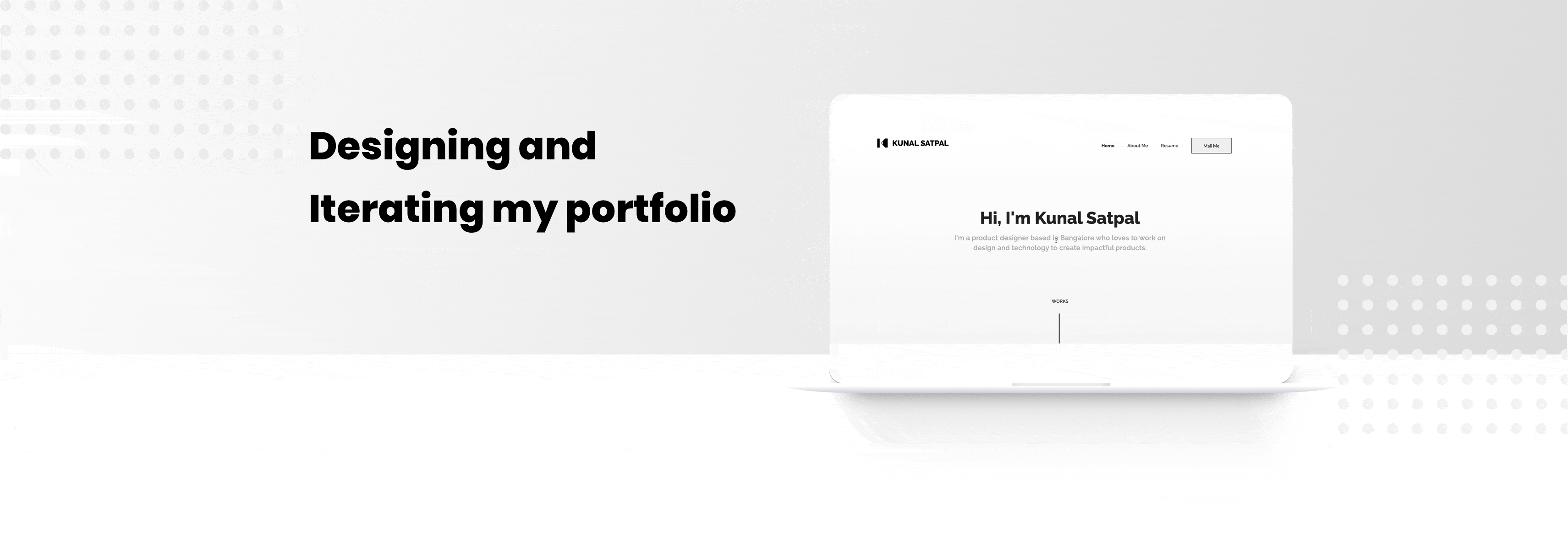
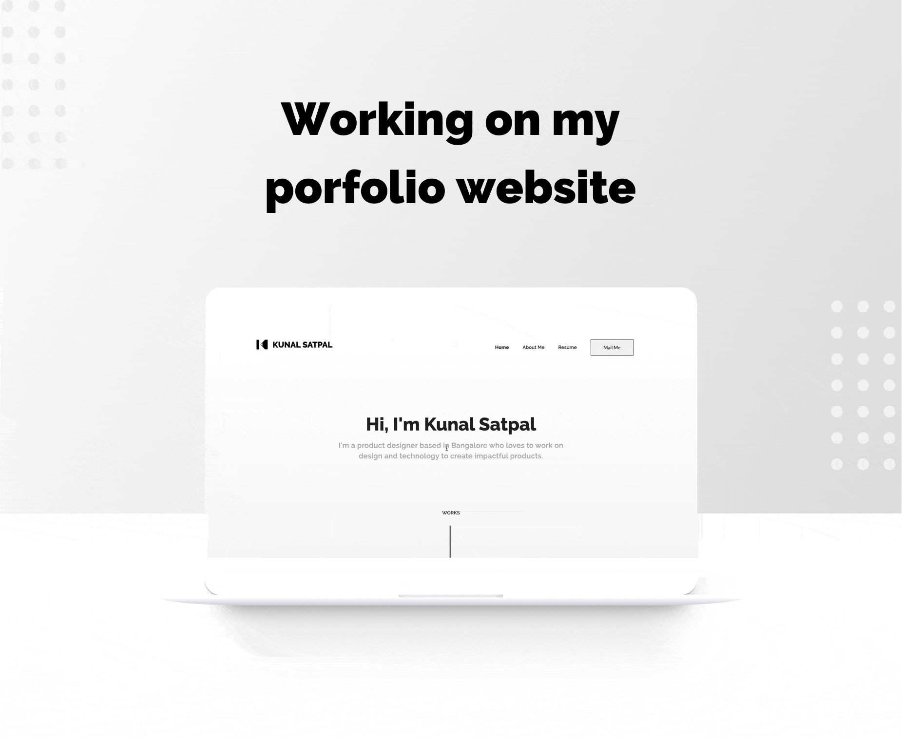
After joining Cure.fit as an intern in 2018, I realized the importance of a portfolio that reflects not just my work, but also my approach and personality. With recruiters inundated with portfolio links, I aimed to design a captivating and concise portfolio to make the most of their limited time.


There are multiple ways in which one can share a portfolio, and it can be a portfolio pdf, Behance, or Dribbble link, website etc. Where most of the online portfolios like Dribbble help designers share what they are up to, mainly focussing on visuals and UI. These platforms are perfect for reach and online presence, but most of the time, companies are not looking for such content.
In my case, I decided to have a website as my portfolio for the following reasons:
- Centralized Content: - Having all my content in one place makes it easier for recruiters to navigate and view my work without the need to open multiple links.
- Adding Personality - A website allows me to present my work in a way that tells a cohesive story and reflects my personality, making a stronger impression on potential employers..
- Overcoming PDF Limitations - PDF portfolios can be cumbersome to download, which may deter users from viewing them. A website eliminates these issues, providing a seamless browsing experience.
- SEO (Benefits) By optimizing my website for search engines, I can attract organic traffic and increase the visibility of my portfolio to a wider audience.
I was just starting my career back then and I was good that I did my research to understand the market before jumping to explorations. Articles online really helped me know for whom to design and what to design. I studied several articles on medium, smashing design, nngroup, and other sources about designing portfolios. Checking other portfolios on the web was also a crucial part of the exploration, how they are trying to solve problems and trying to find out the reasons behind some decisions.
Being on my internship, I also talked to a few designers over there to understand what they look for in a portfolio.
Making sure that users can easily navigate through your content is an essential aspect for every product. Once I was evident with the users' intent and what are the things to be focused, it wasn’t tough to work on navigation.
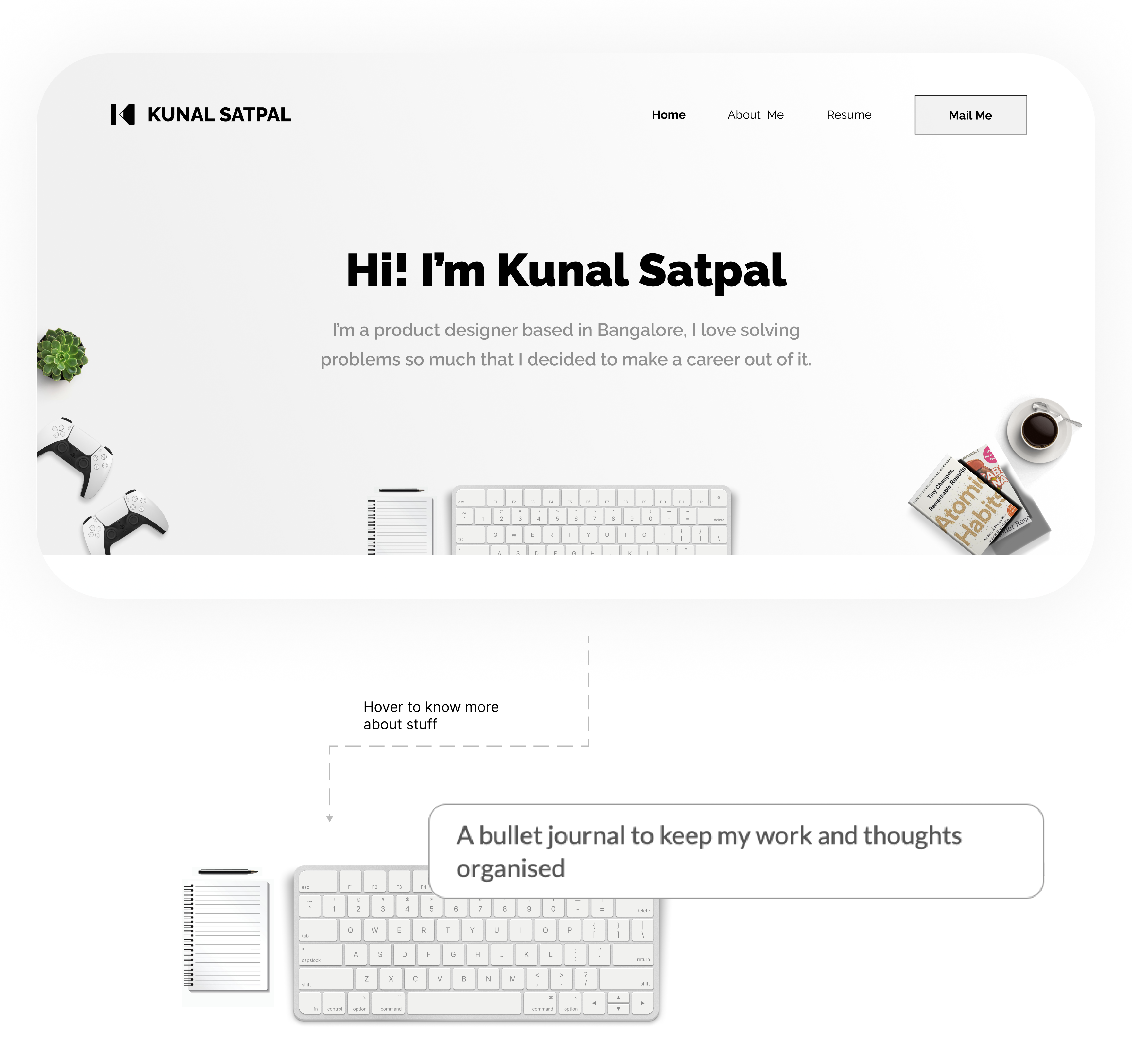
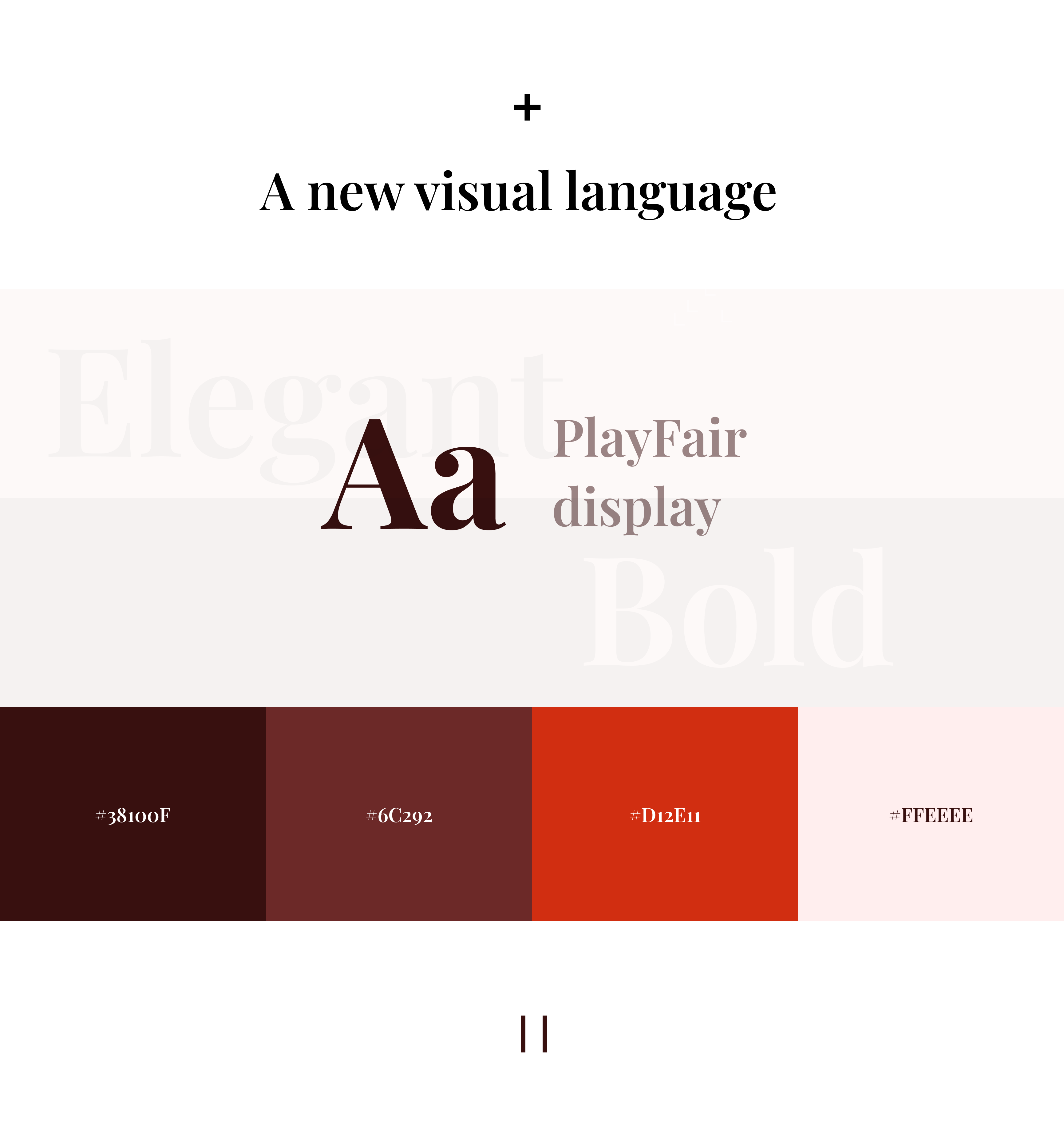
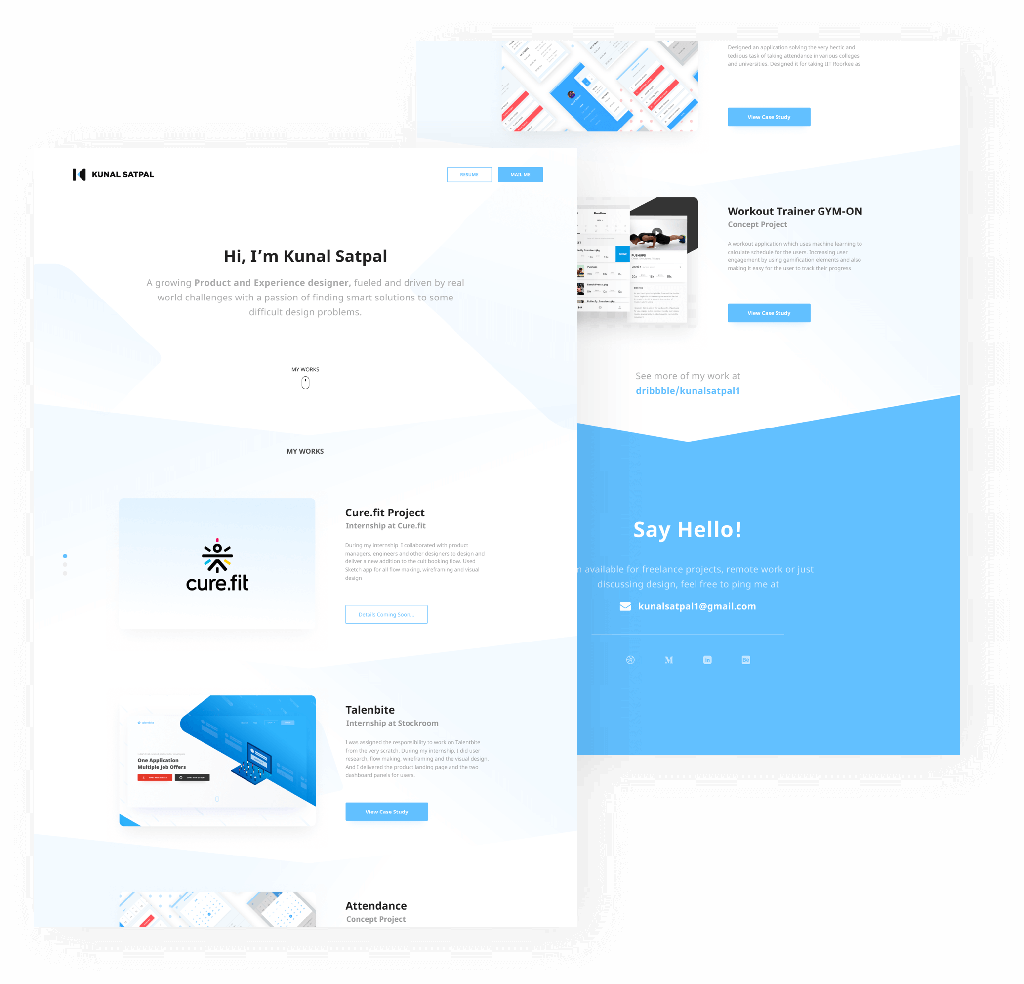
The idea was to make it simple and sweet, content being the hero and serving the purpose rightfully. I decided to follow a minimal approach for my portfolio and focus on creating the right story with a high focus on the case studies.
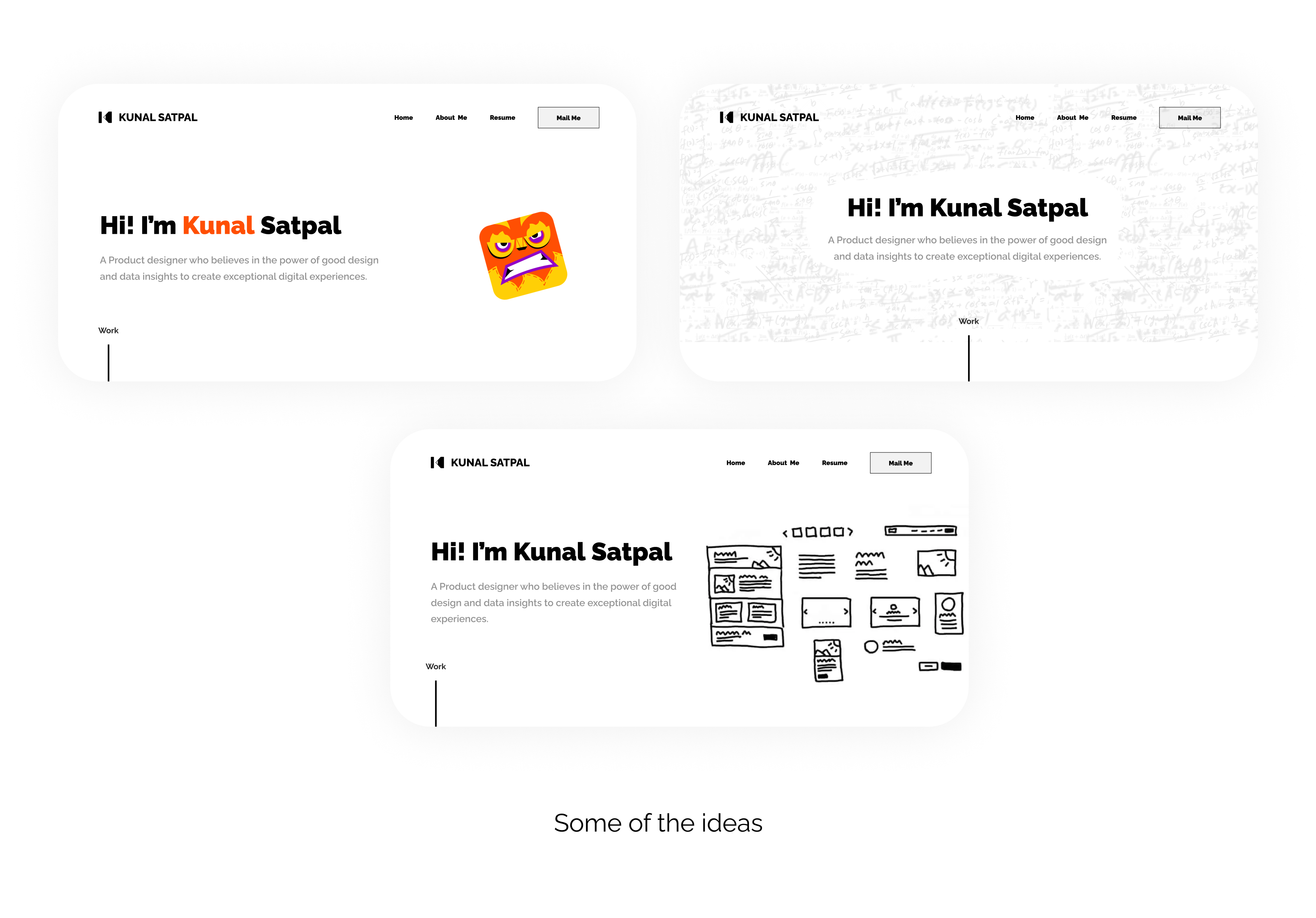
It was challenging to get sure of the visuals, it should not only give a unique personality to it but also empower the content. It took me some time and quite some iterations, but in the end, the result was satisfactory.
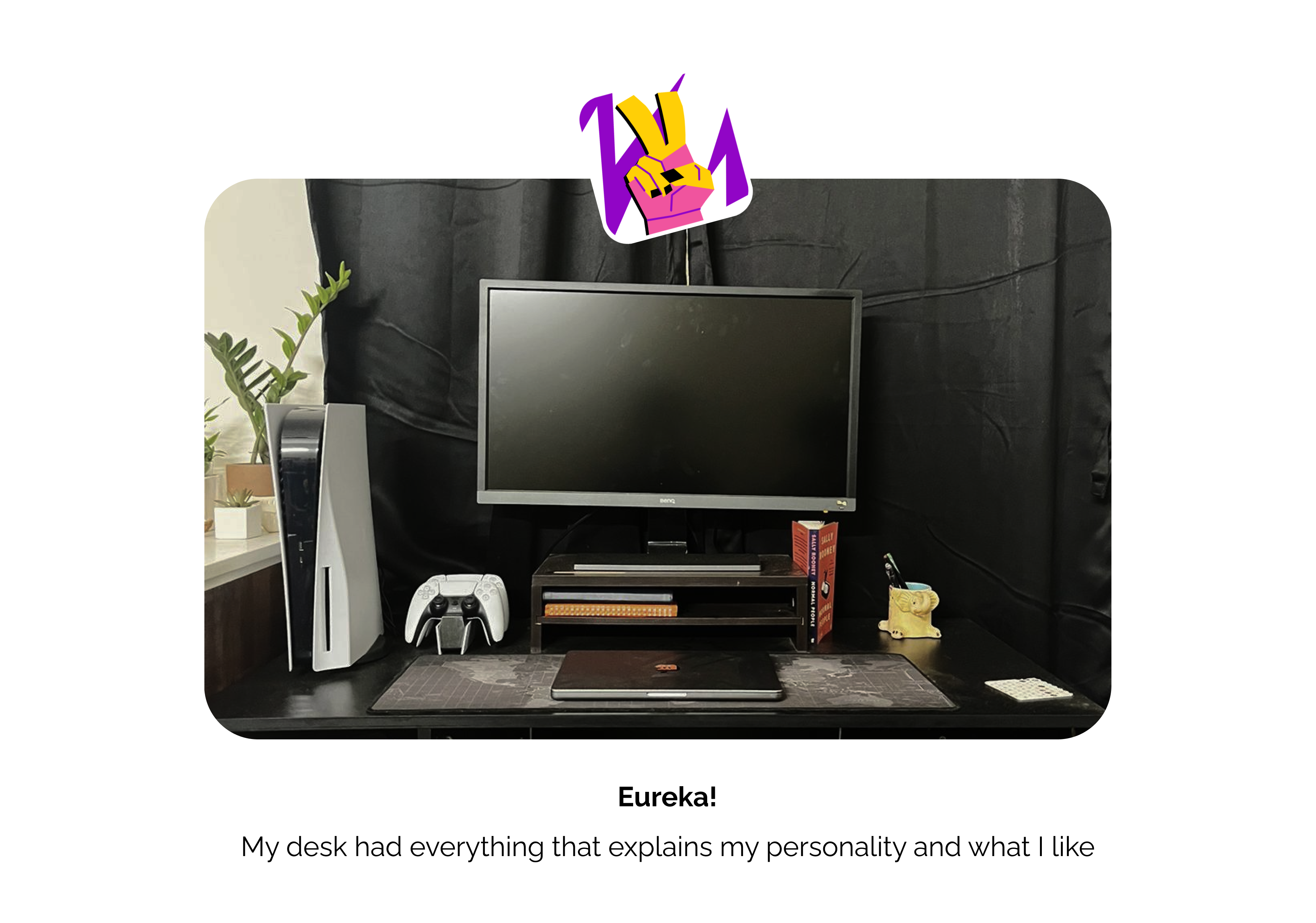
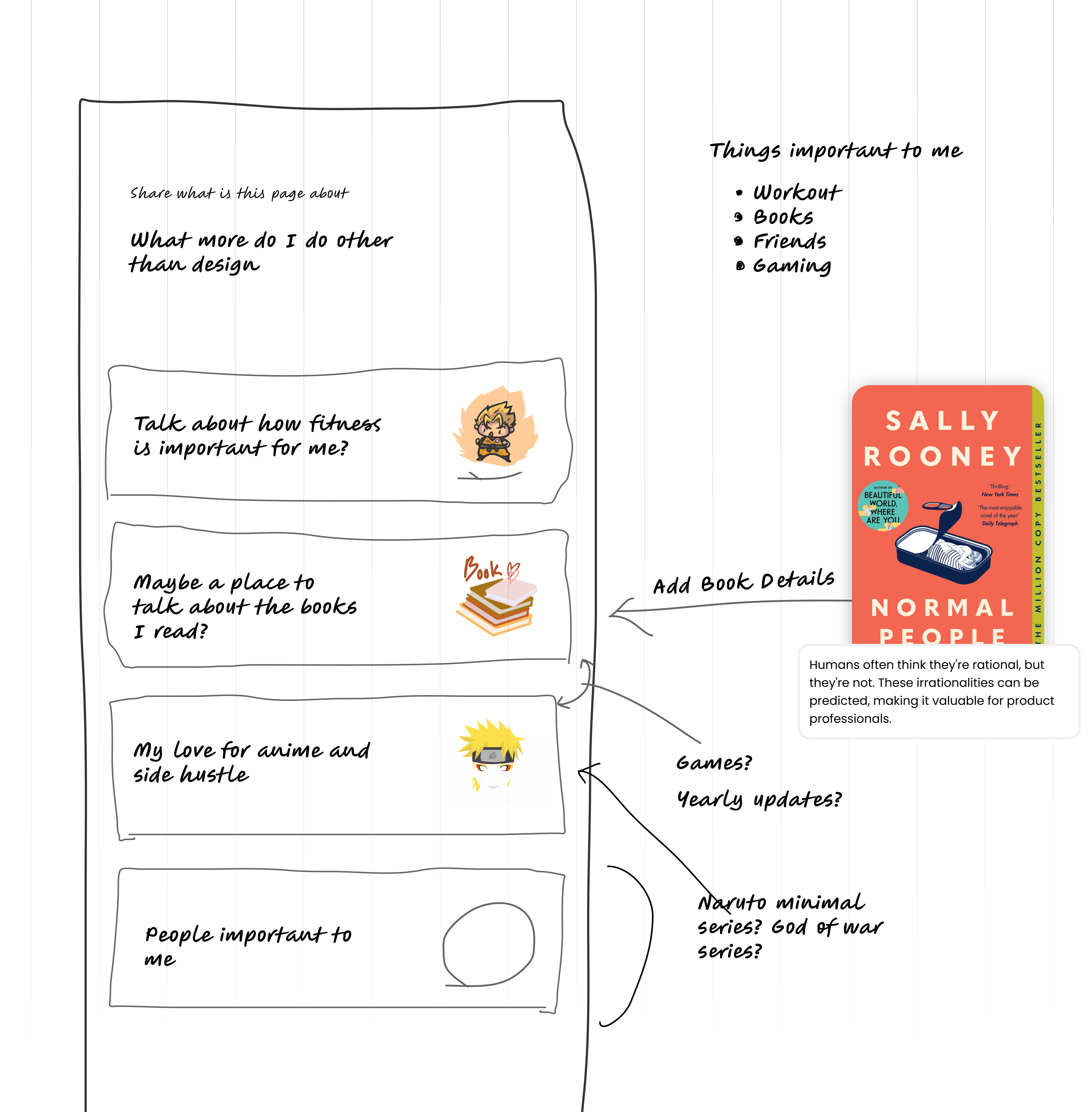
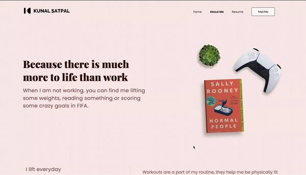
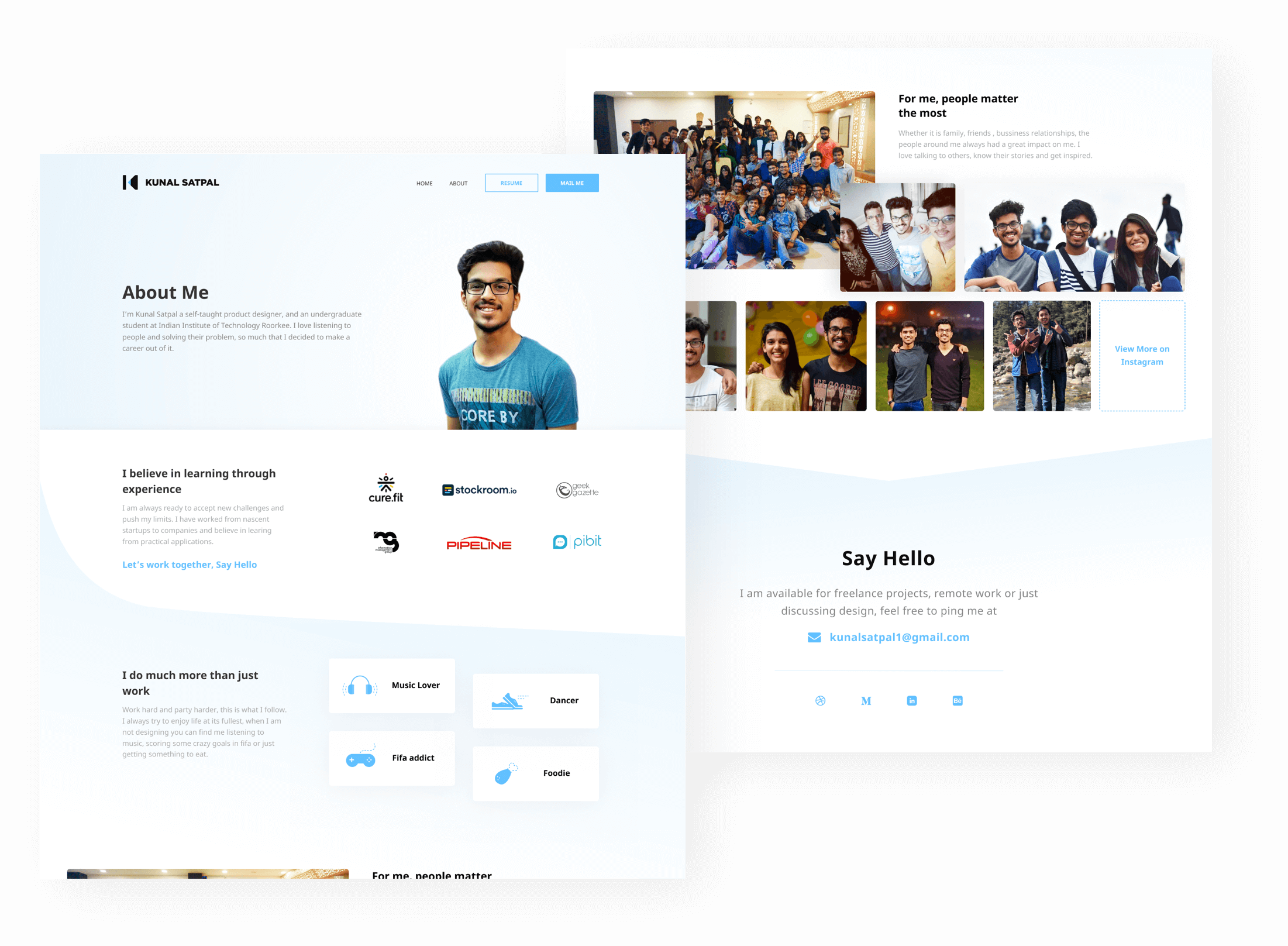
Every page has its story and for this page the story was about my life. I wanted to make sure anyone who lands on this page gets to know my professional as well as the personal self, Who is Kunal Satpal? What he believes in? What does he enjoy?, and what matters to him the most? Everything had to be answered.
I was no developer back then, it took me quite some time to perfect every part of it, but in the end, it was amazing, and I also learned a lot about development in the process. Thanks a lot to Praduman Goyal and Dhruv Bhanushali for helping me out with this.
Three lines of code to every page and this powerful tool allowed me to analyze user behavior, track drop rates, bounce rates, exits, and session time etc. With Google Analytics, I can gain insights into different cohorts and time frames, helping me understand and optimize my website's performance.
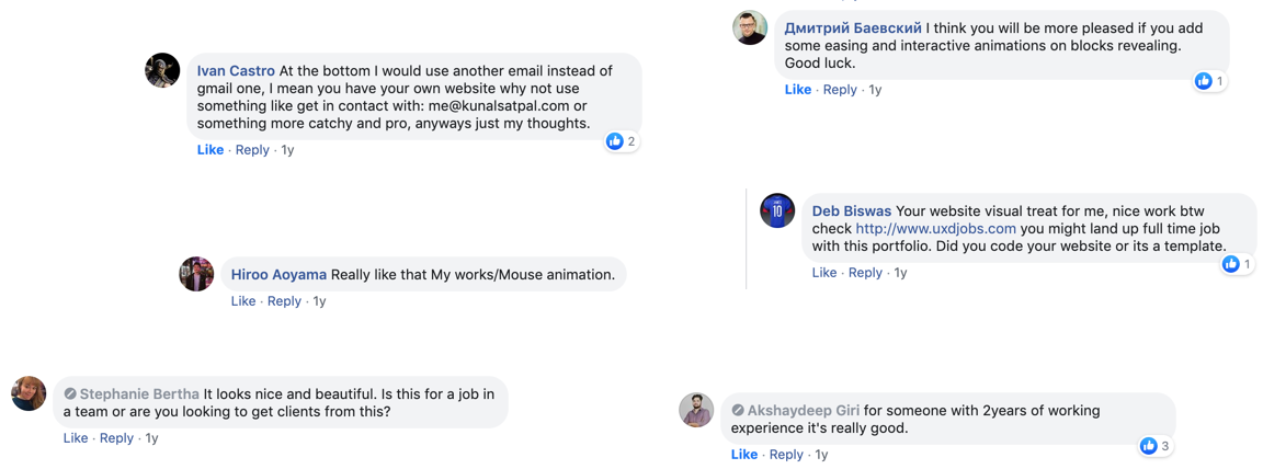
The launch is where the real journey started; I got several messages on social media from people who liked the website and also who found bugs. I also got a handful of feedback on my website, from the readability, layout to the content.

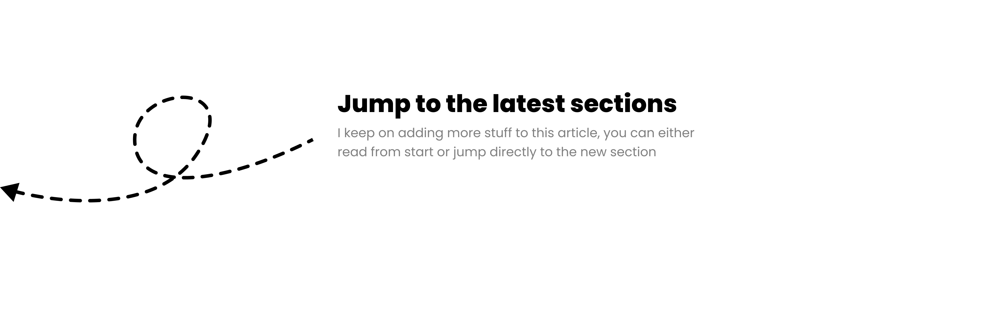
Launching was just the first step, the following section is the journey of how and why I kept on experimenting with my portfolio and what all I learned in this time.
What to do once it is is launched?
- By putting out your portfolio on the web and showcasing people. You’ll get lots of love and feedback at the same time.
- Keep it alive, present it to as many people and designers possible, know their views/feedback for the same.
- Don’t hesitate with the feedback and note them all.
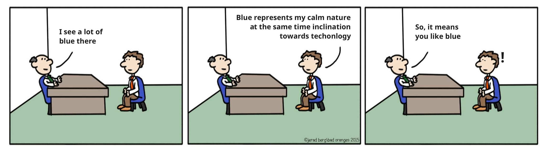
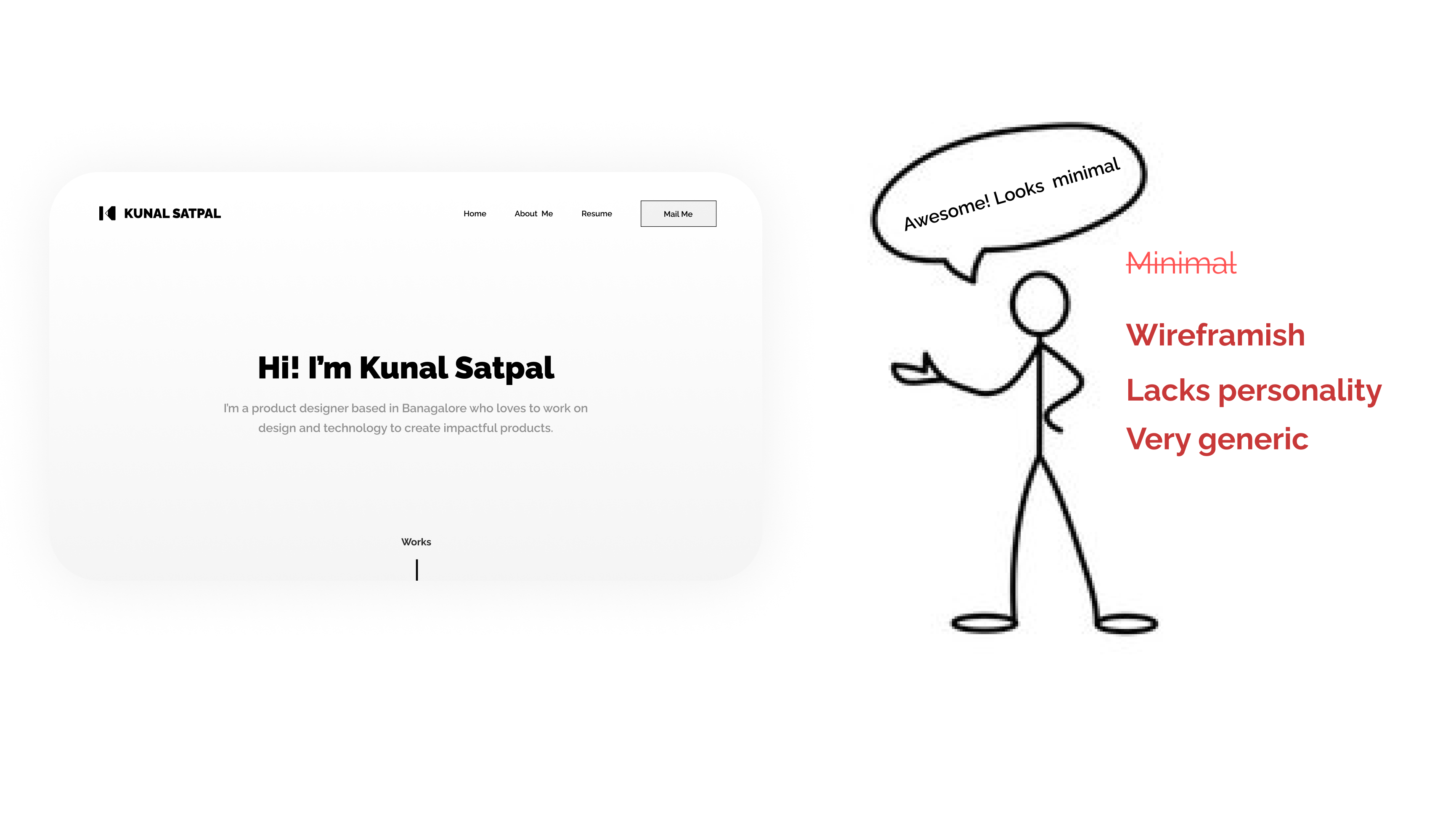
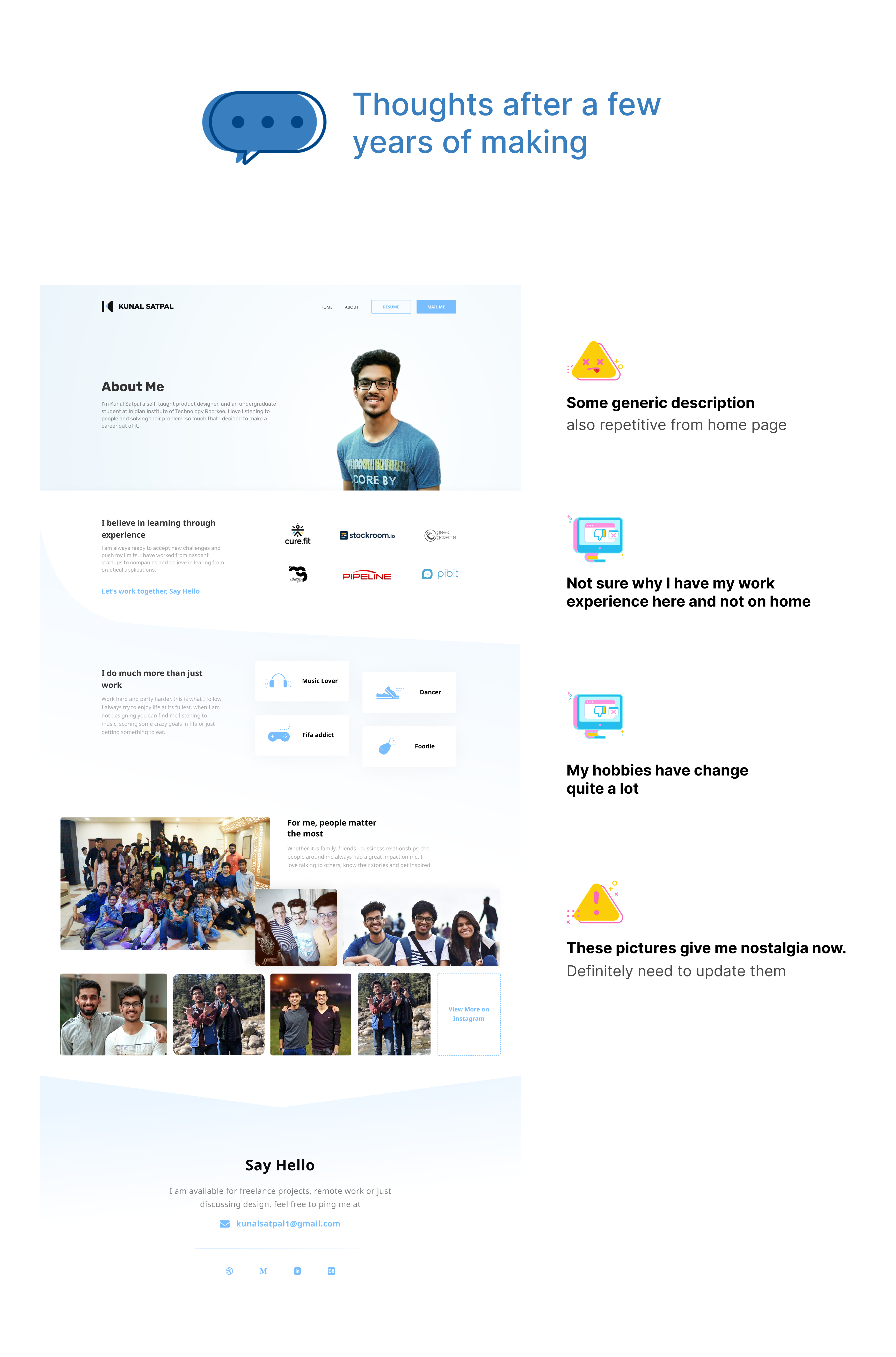
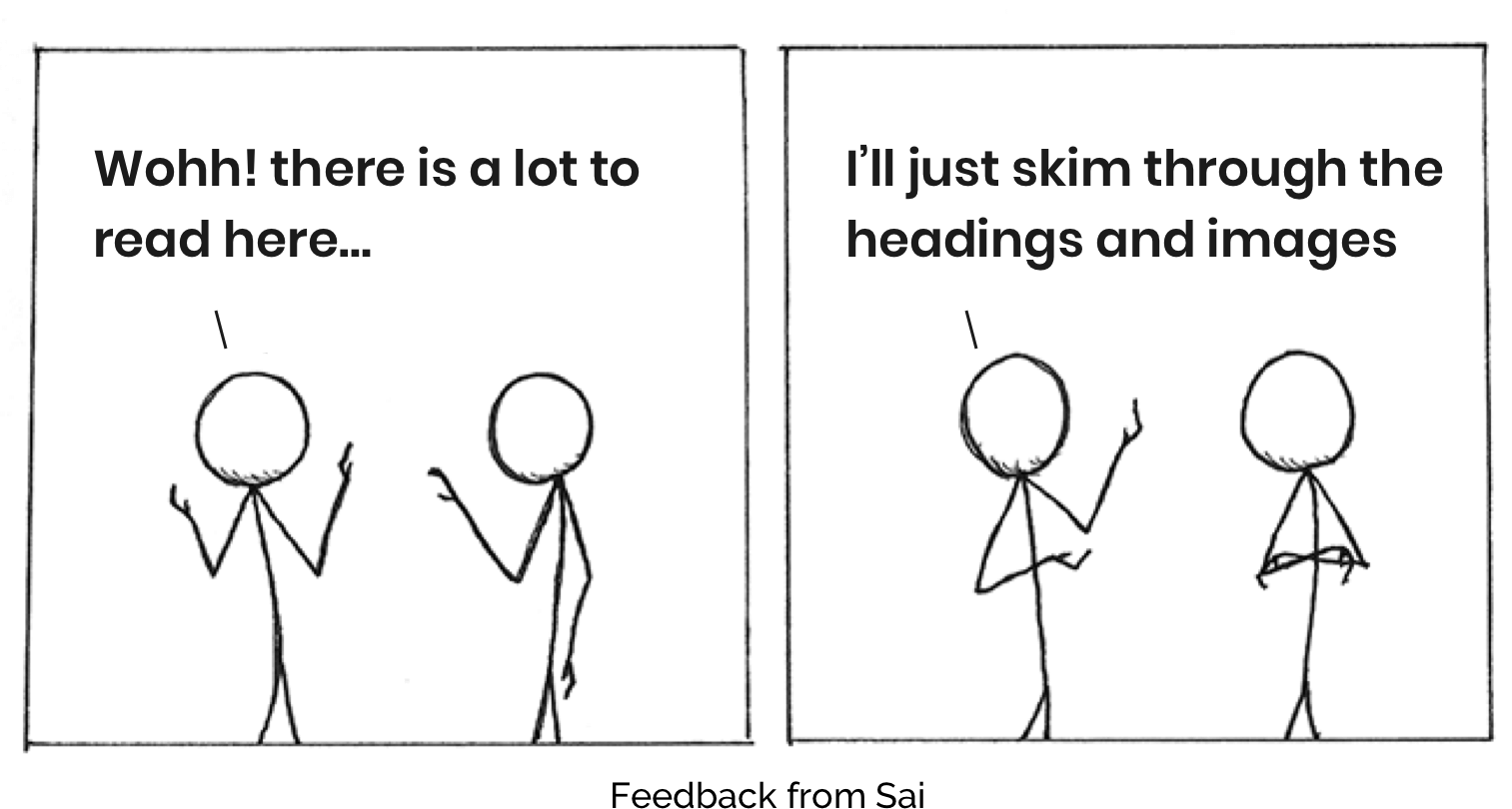
One significant feedback I got from my colleague Sai Nihas- “There is much description on the home page, what purpose does it serve”
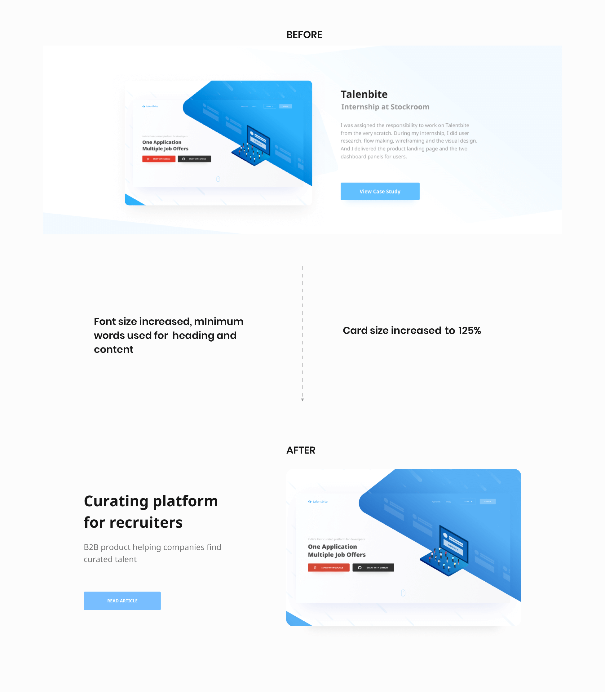
Considering our target users are busy individuals who are often overwhelmed with numerous websites. Having excessive text and content on the home page could lead to cognitive overload and a high risk of quick drop outs. Given their low attention span, our users needed something easily consumable to capture their interest within a few seconds.
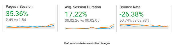
With the help of google analytics I found that the average session duration increased tremendously and drops from home page also reduced. It was so good that I checked them thrice before jumping to conclusions.
This website is still evolving, and with hotjar integration, the heat maps, misclicks, scroll percentage, etc. I was able to know more about the user behaviour.


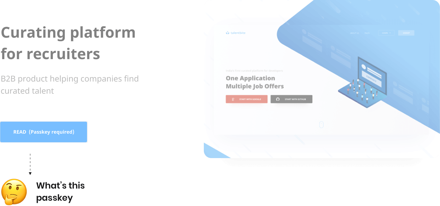
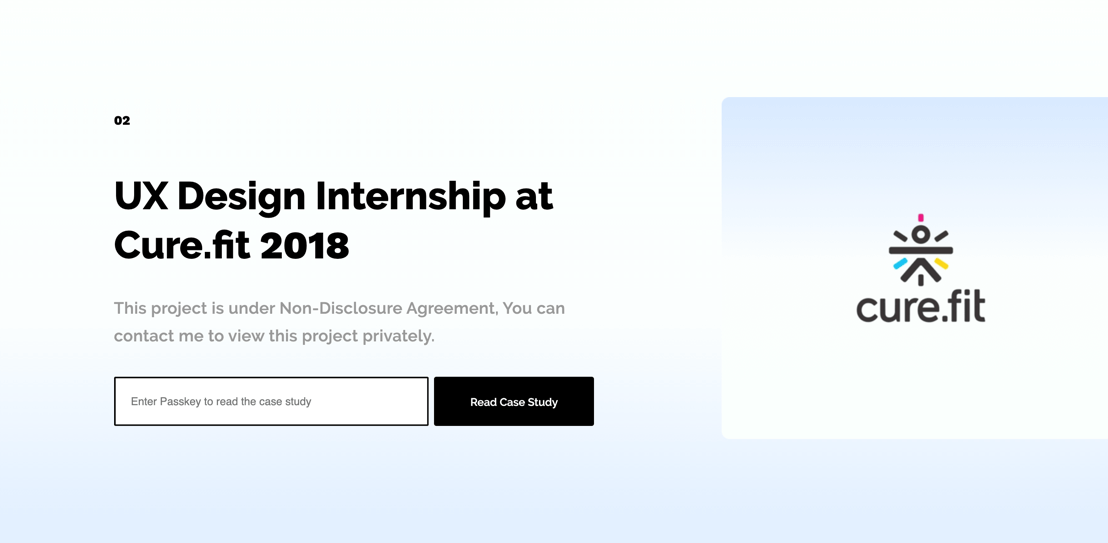
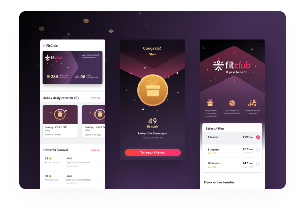
In february 19 when I was looking for internships, a sudden roadblock occured, my last two projects both were under NDA and I can not share them publicly i.e. I can’t put them on my website.
This is when I decided to create a pass key system that will let users view the case study on the website itself if they have the pass key.
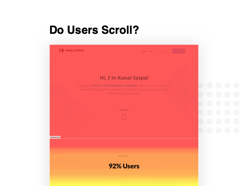
Hotjar provided the data for the deep scroll, the miss clicks and screen recordings.
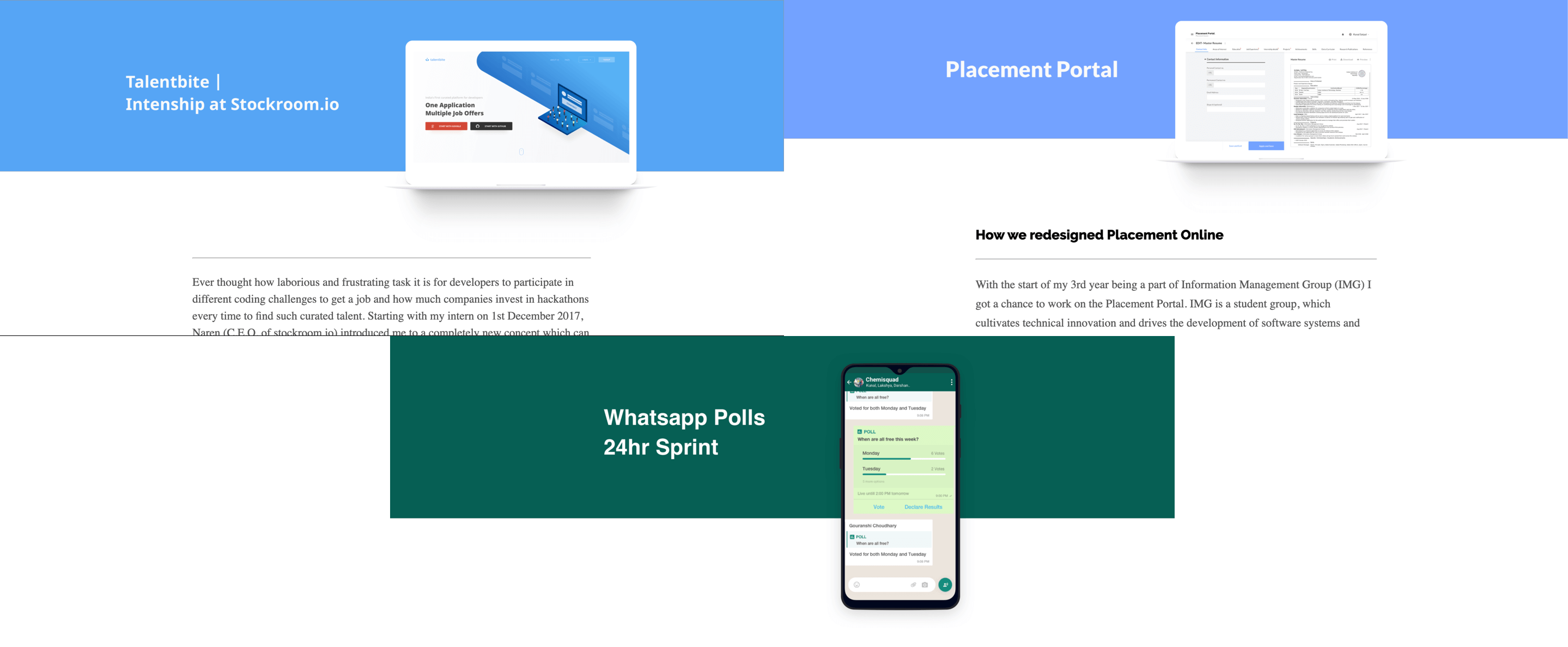
With the increasing number of articles, case studies, blogs it was really tough to keep the scroll limited. Even adding one case study to the website means adding a full page, this wasn’t scalable.
small With a small stack of cards, more content can be fitted in the same screen size, description and subheading had to be removed to avoid cognitive overload. It also helped in differentiating between case studies and blogs moreover emphasizing on the bigger cards of case studies.
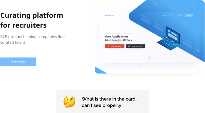
With more than a year passed, a number of things changed in my website several articles were added and now things had to be curated and images to be reduced so that website speed is not compromized. At the same time due to the lack of guidelines for imagery there was inconsistency in various cover images used across the website.
Final covers look like this.