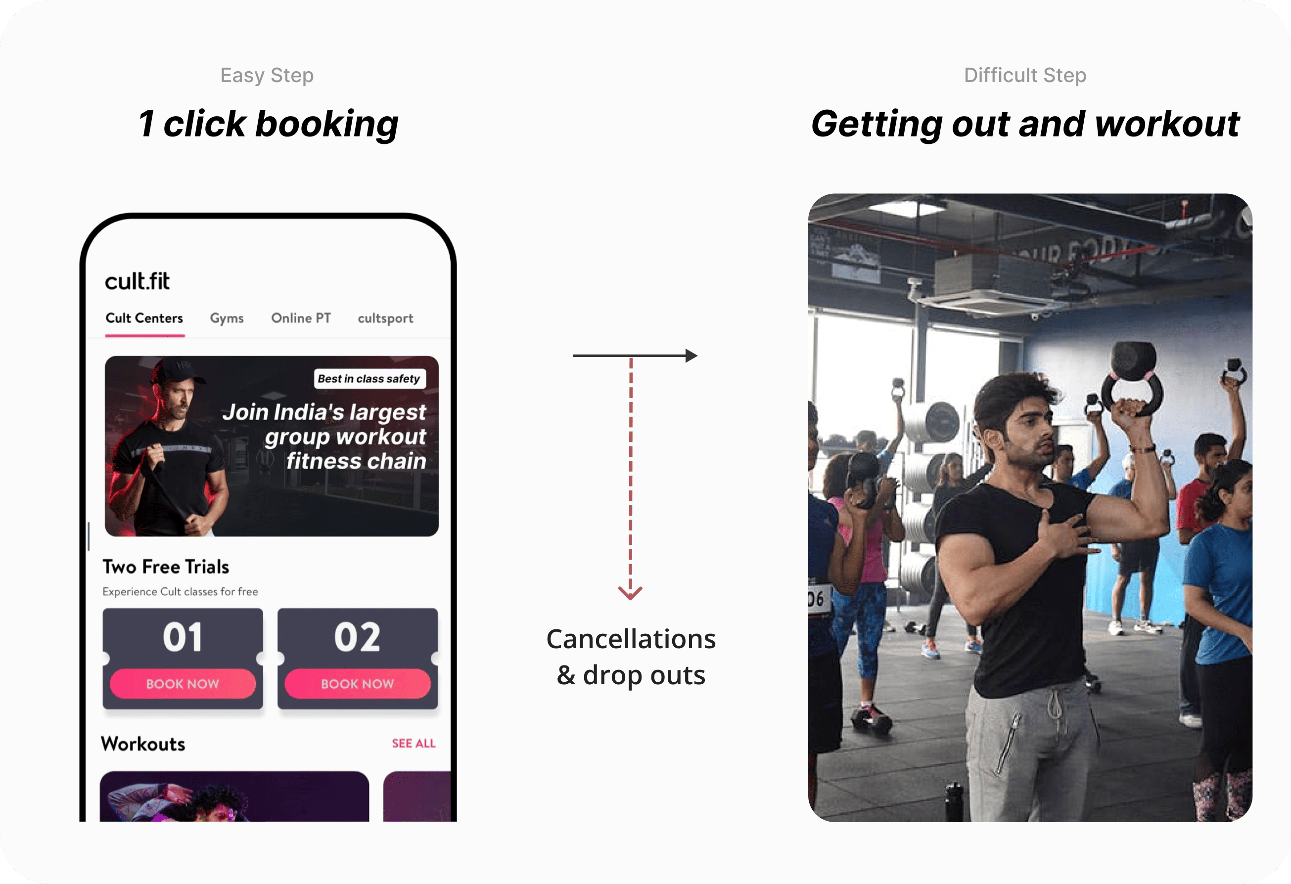
Solving for increasing user engagement and revenue generated per user by expanding Fitclub to Cult/Mind. Measuring success in terms of classes attended per user, per month.
Success criteria in short term and long term
- Short term -> Activity should substantially improve y% classes attended per month. This should go to x%
- Long term -> Incremental retention revenue should be greater than the burn
Guard rails
- Quantitatively, product rating shouldn’t be impacted.
- Qualitatively, core benefit should be positioned as fitness. Rewards shouldn’t take the center stage
- Who will get the reward?
- When will they get the reward?
- How will they get the reward?
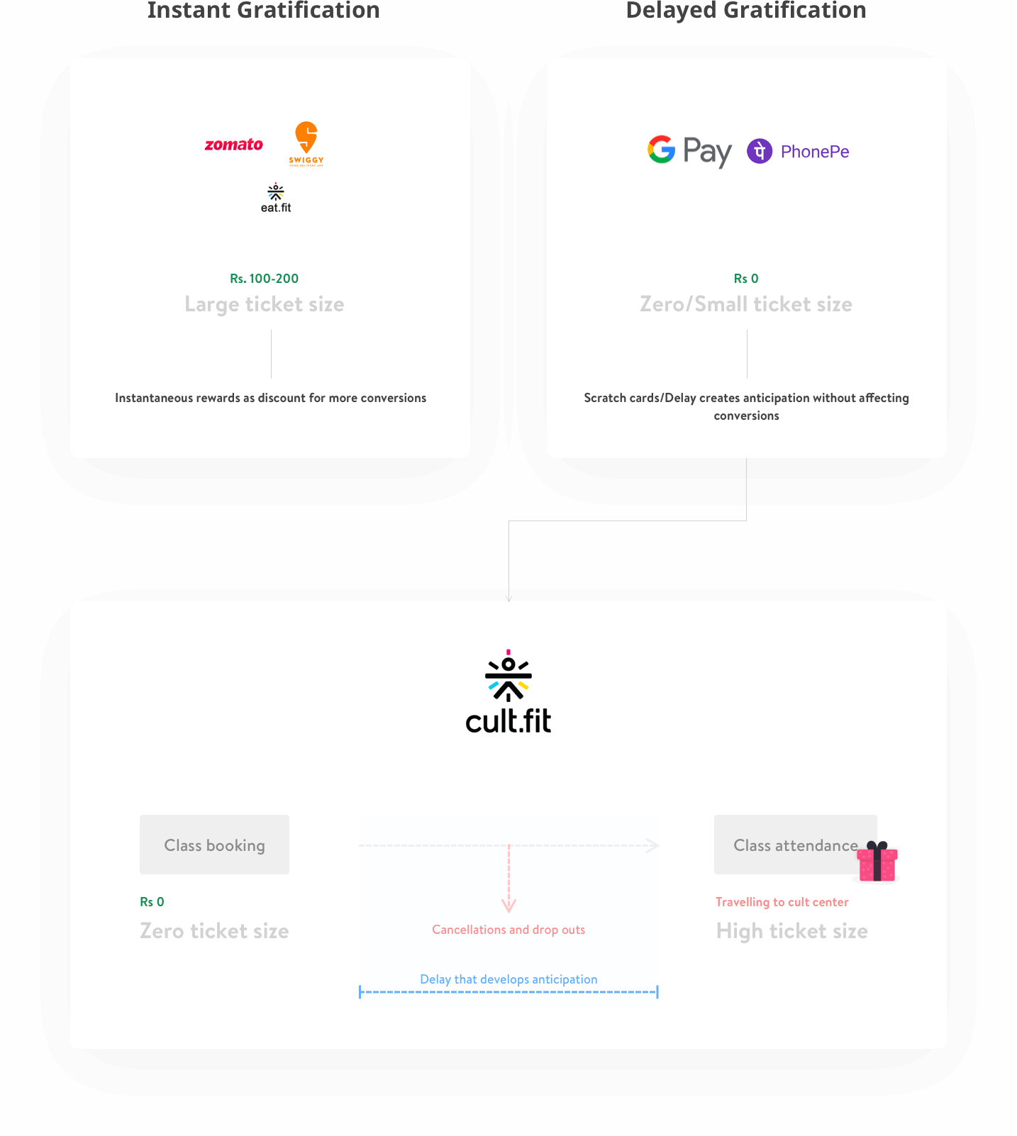
This overall scope was defined after a number of discussions and debates over the product strategy, future goals, etc. Here are a few terms explained which affected the overall product:-
| Eat.fit Members |
Users already using fitclub for Eat.fit orders.
|
| Cult/Mind Members |
|
- Who will get the reward?- Every FitClub member is eligible to get the reward - this includes all Cult/Mind members, as well as users who are not members. User motivations very much different from Eat.fit users.
- When will they get the reward?- Eligible users will get the reward upon completing every Cult/Mind class. The reward will, however, be limited to 1 per day. (Due to business constraints)
- How will they get the reward?- The users will receive the reward on the app (not on the web in v1) - the reward will be variable and will be revealed. Even if the user books the class via the web and attends it, she will get the reward message - but to avail, she has to use it on the app.
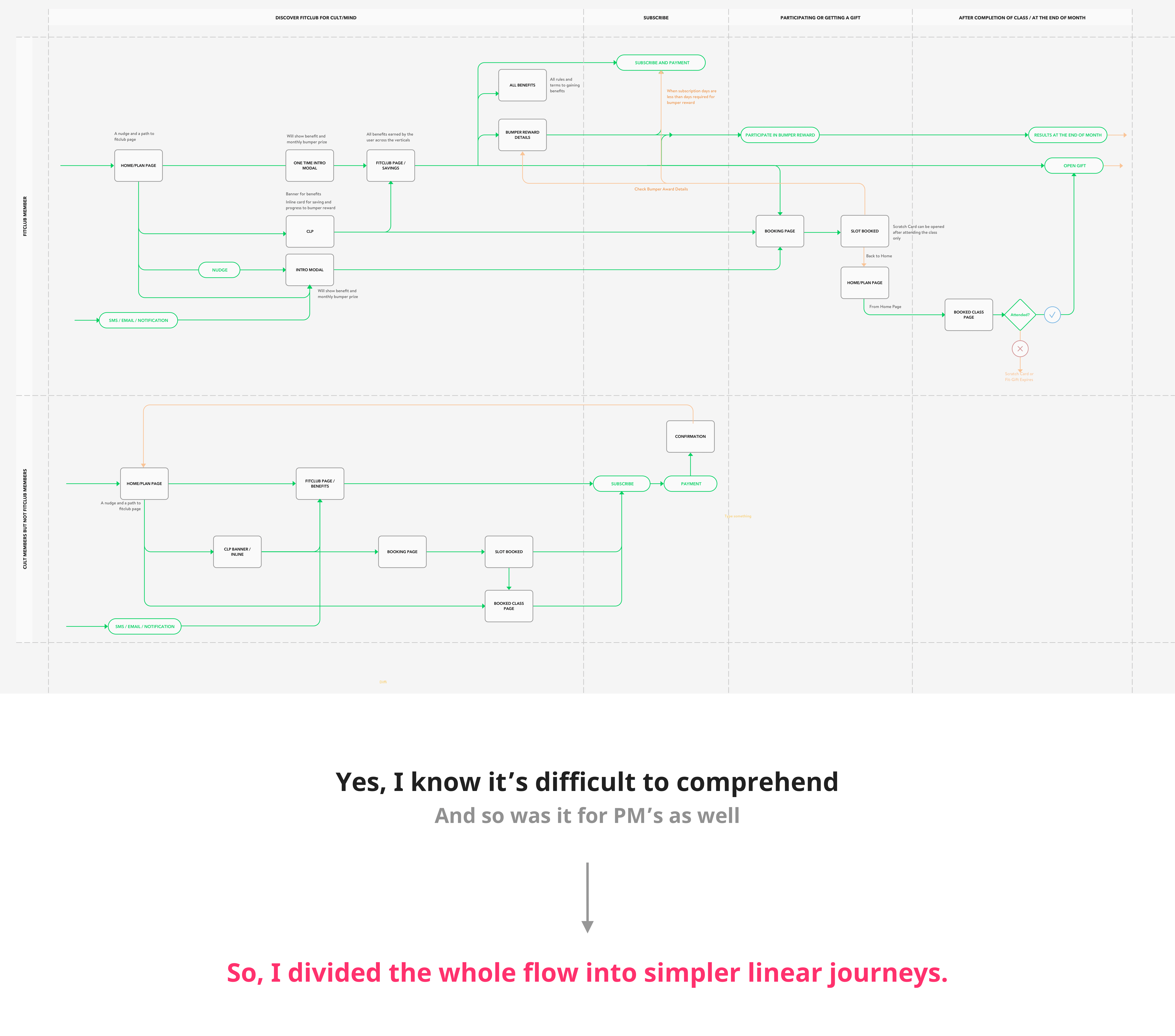
Users encounter multiple entry points to the application form, ensuring they learn about FitClub rewards to build anticipation.
All entry points direct users to the FitClub page
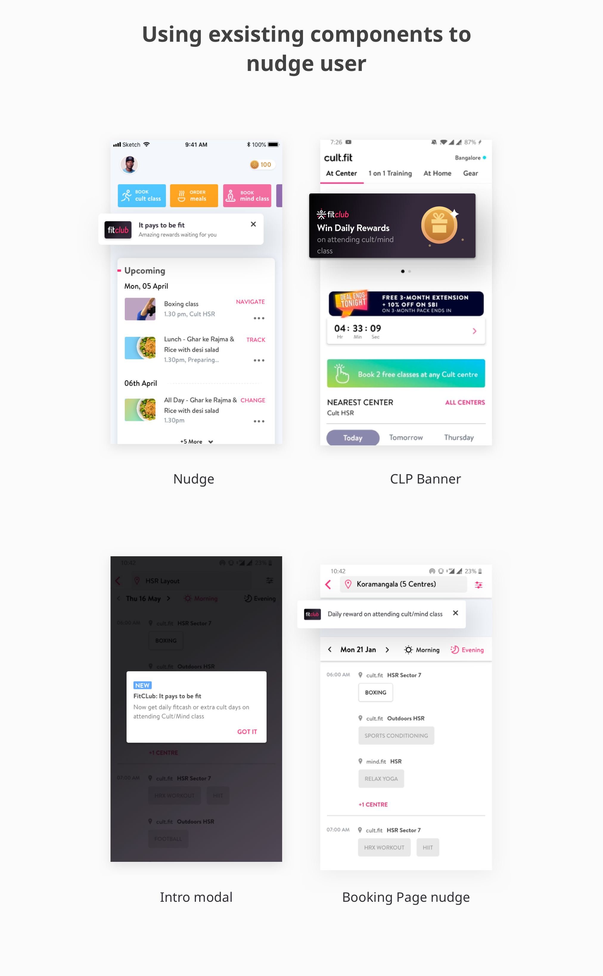
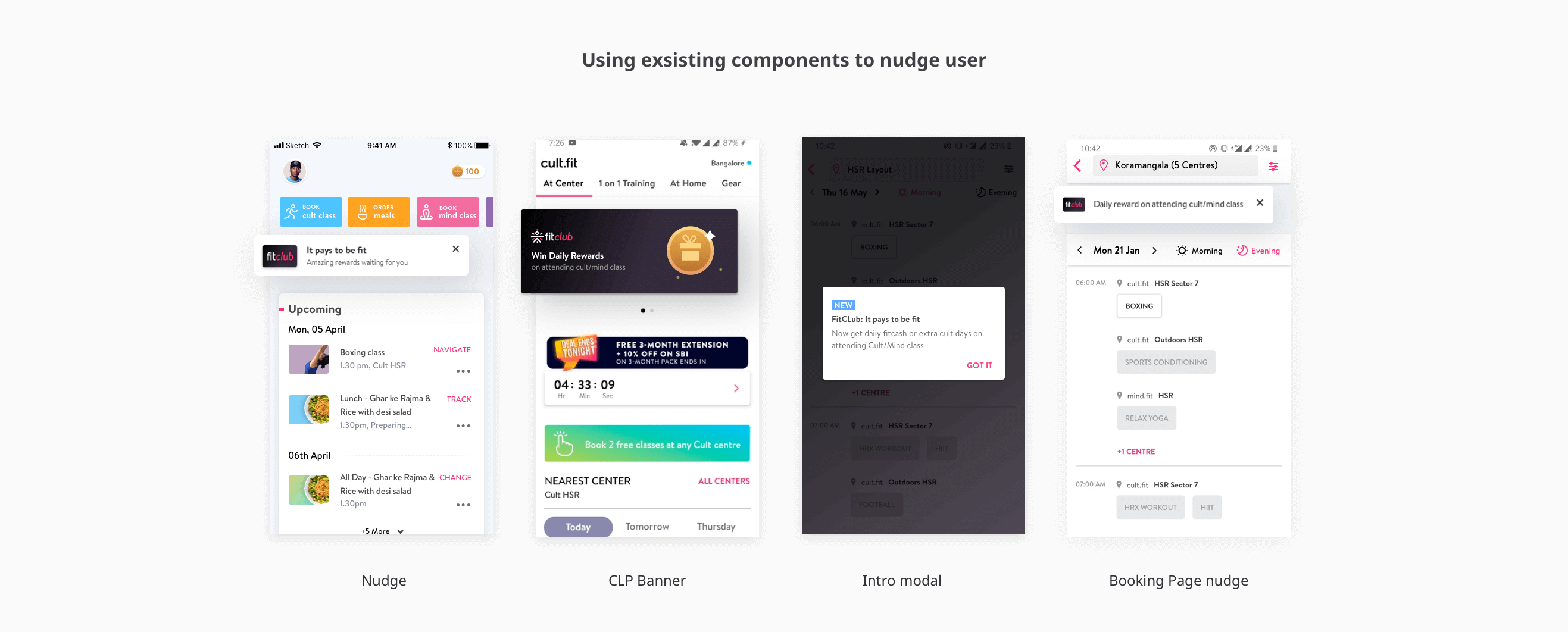
Learning in flow is more effective than a single detail page or onboarding. Nudges across the app educate users and build anticipation, as rewards unlock after class. Users can reveal rewards on the home or FitClub page
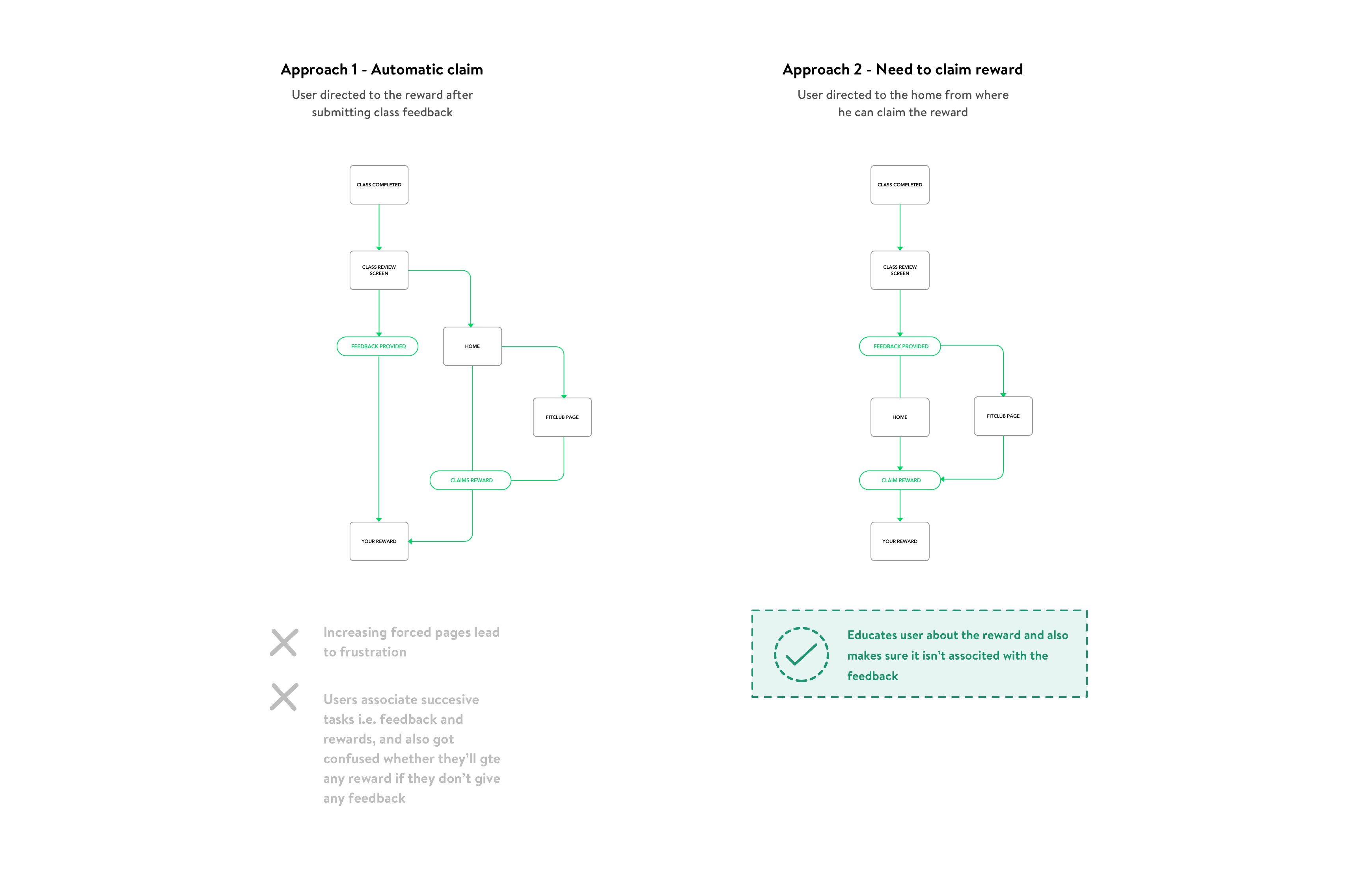
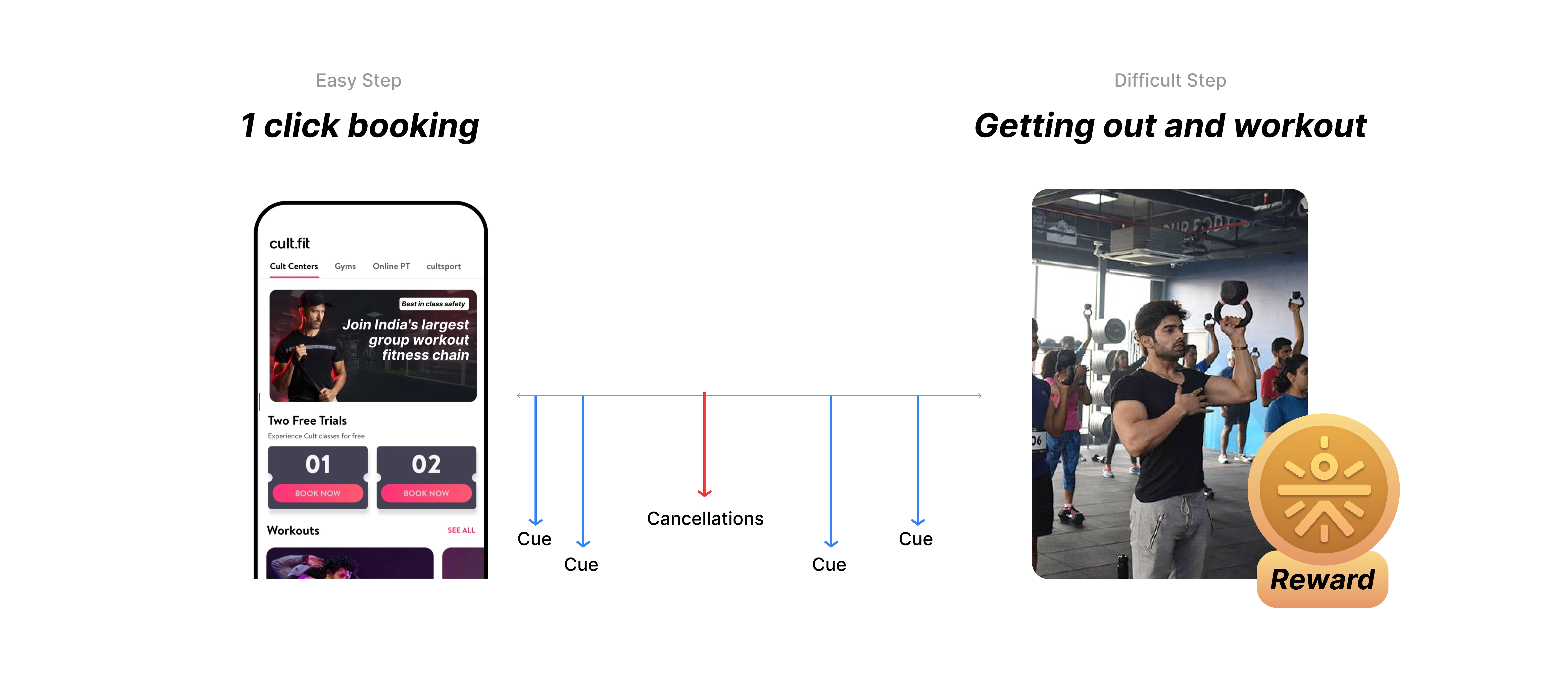
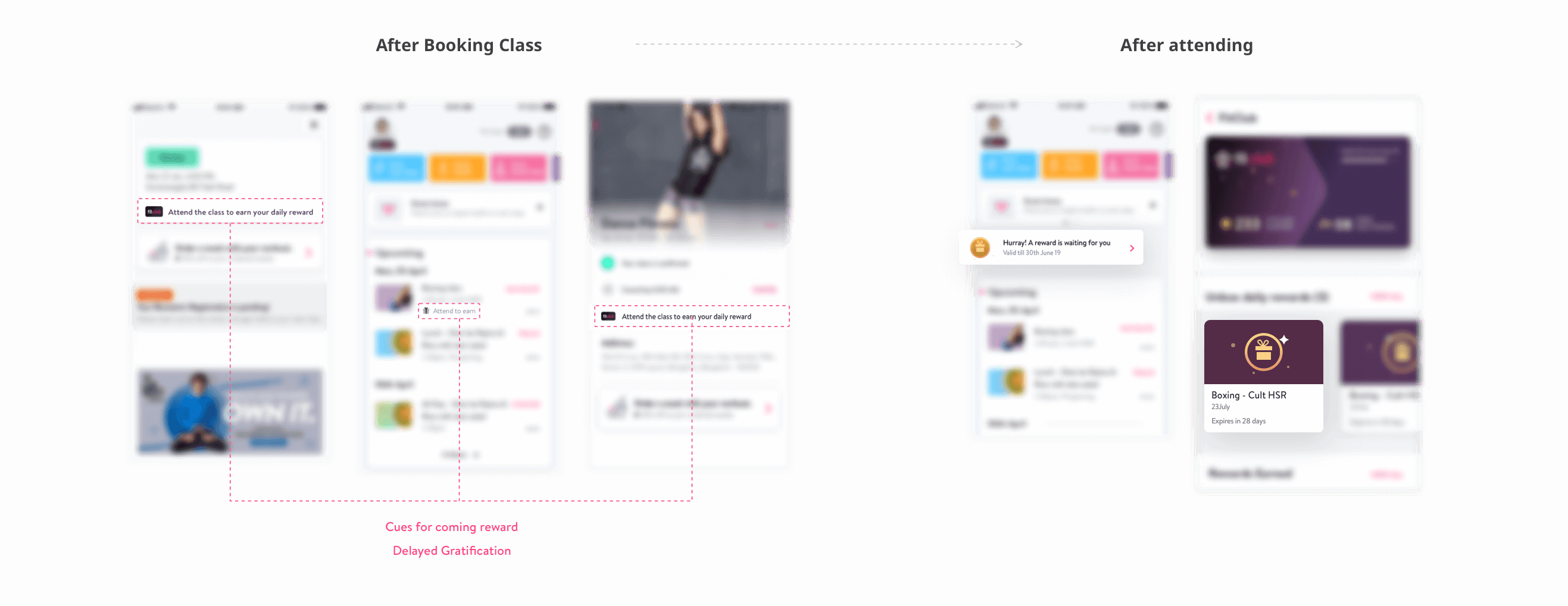
Experimenting with multiple reveal interactions were fun. Initially, to further increase the anticipation, we decide to take some action to claim the reward, similar to what we do in scratch cards. Later we realized we are overdoing this, and we removed it from the interaction.

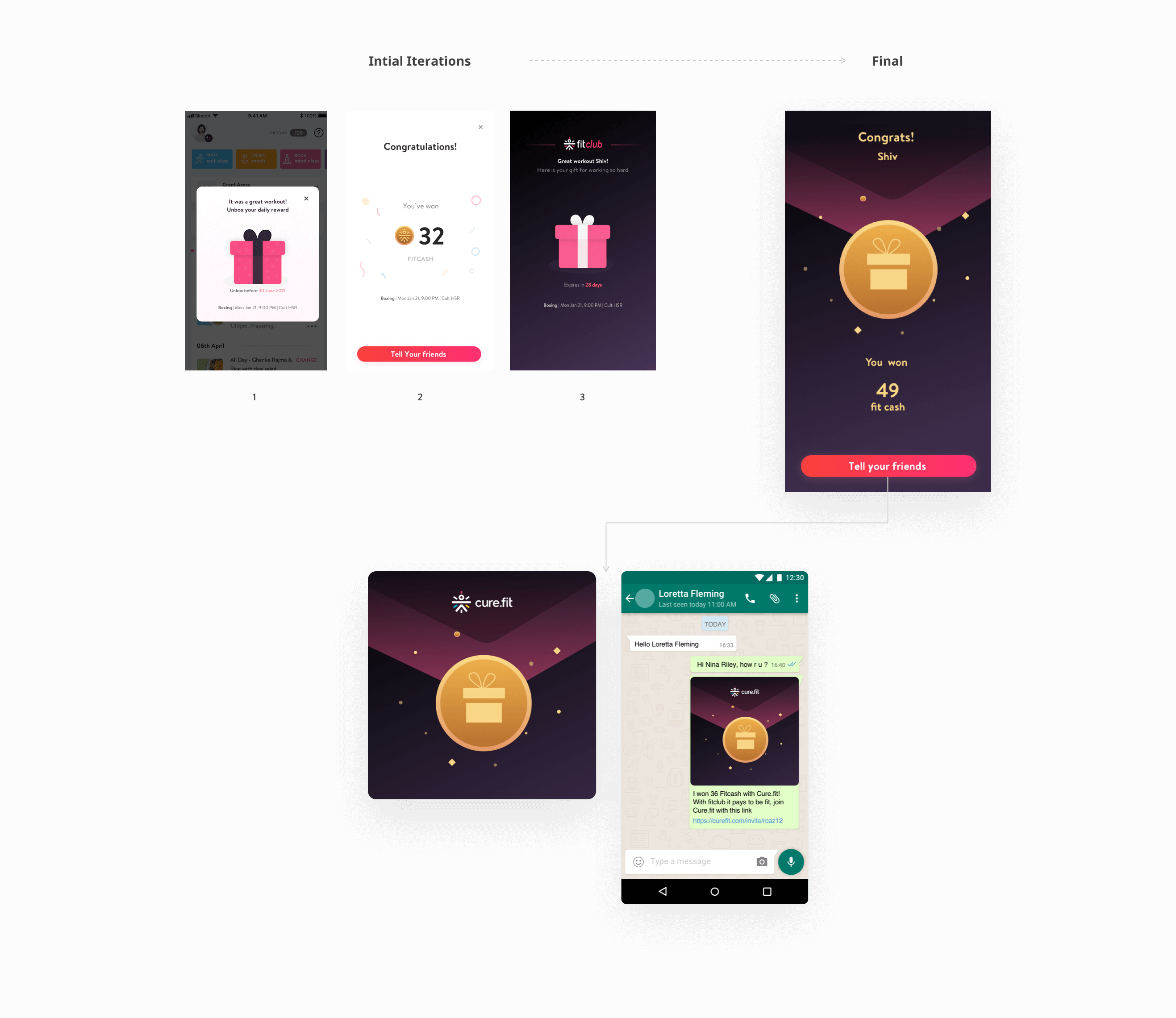


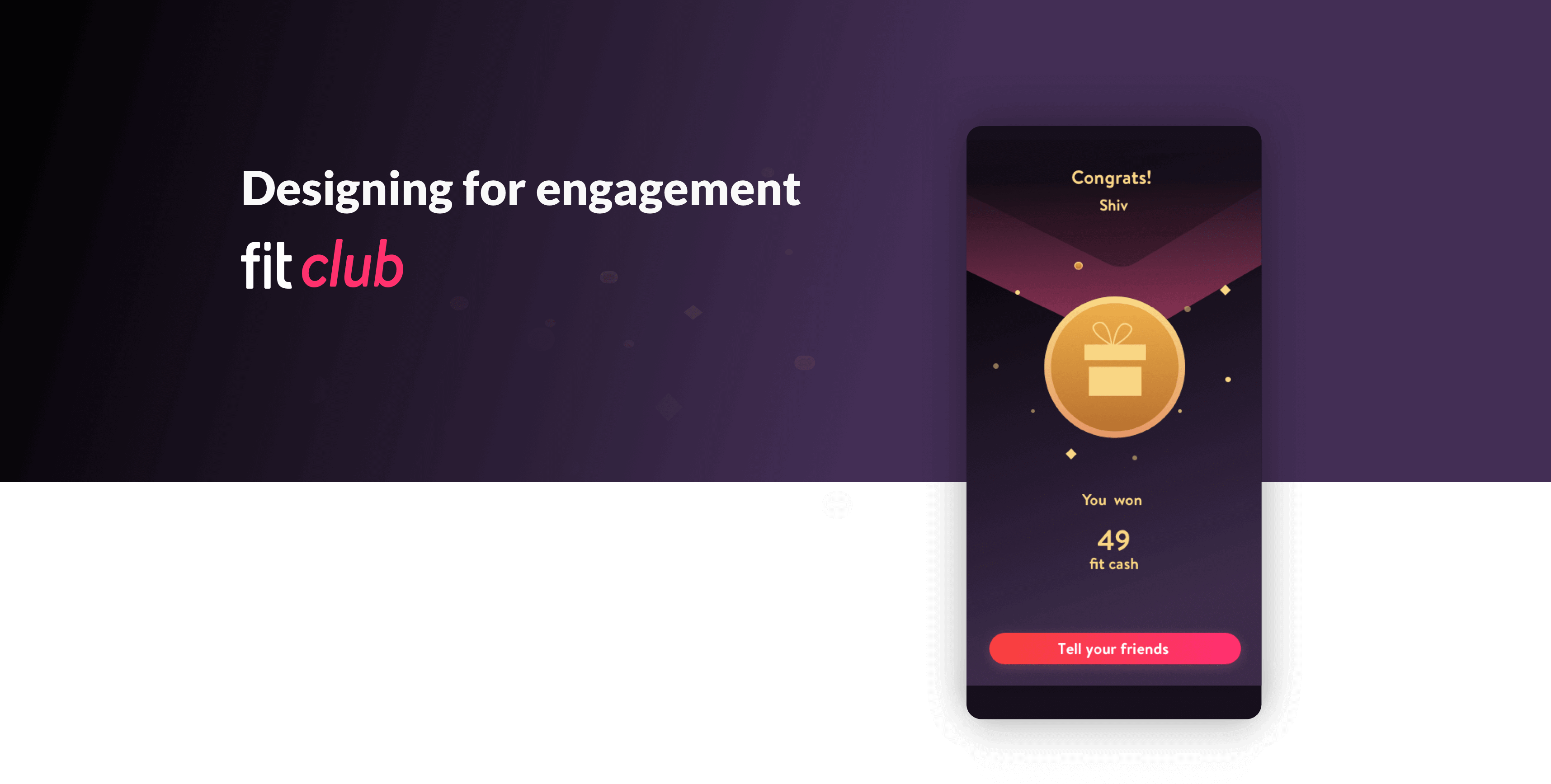
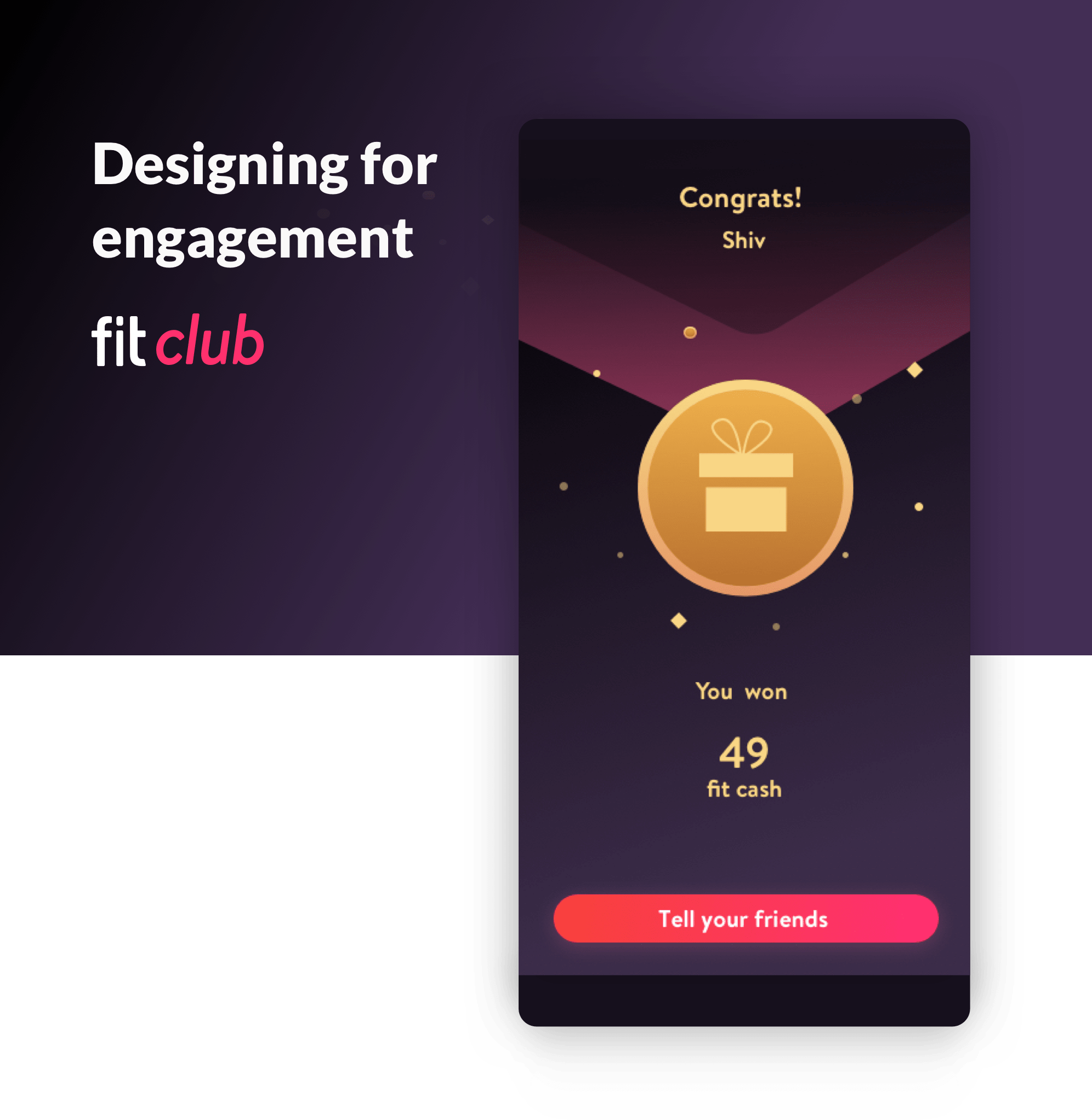
We moved forward with the reveal interaction, which requires no extra effort from the user's side. Moreover, it can't be in continuation of feedbacks as it might become a big blocker and lead to drops. We further finalized the gift concept and visuals before completing things

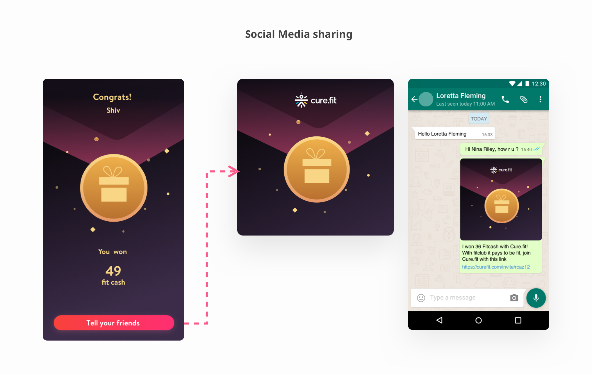
Once the user has claimed the reward, he can share the achievement with friends. We know 95% of gamers are socializers so leveraging that power is a must.
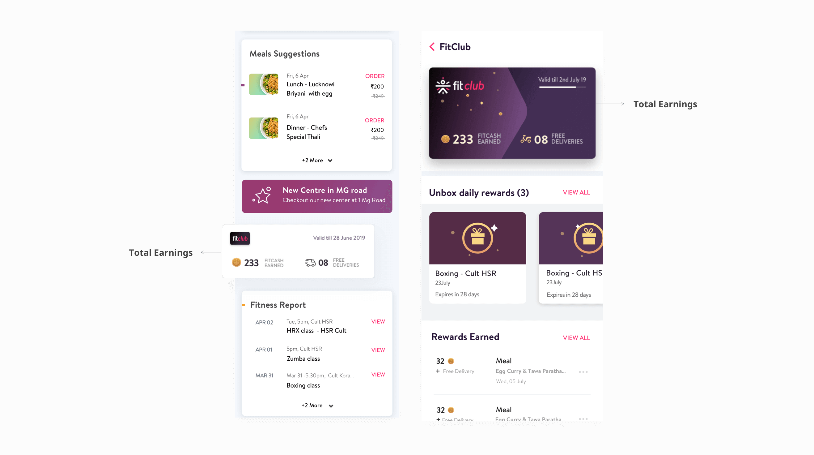
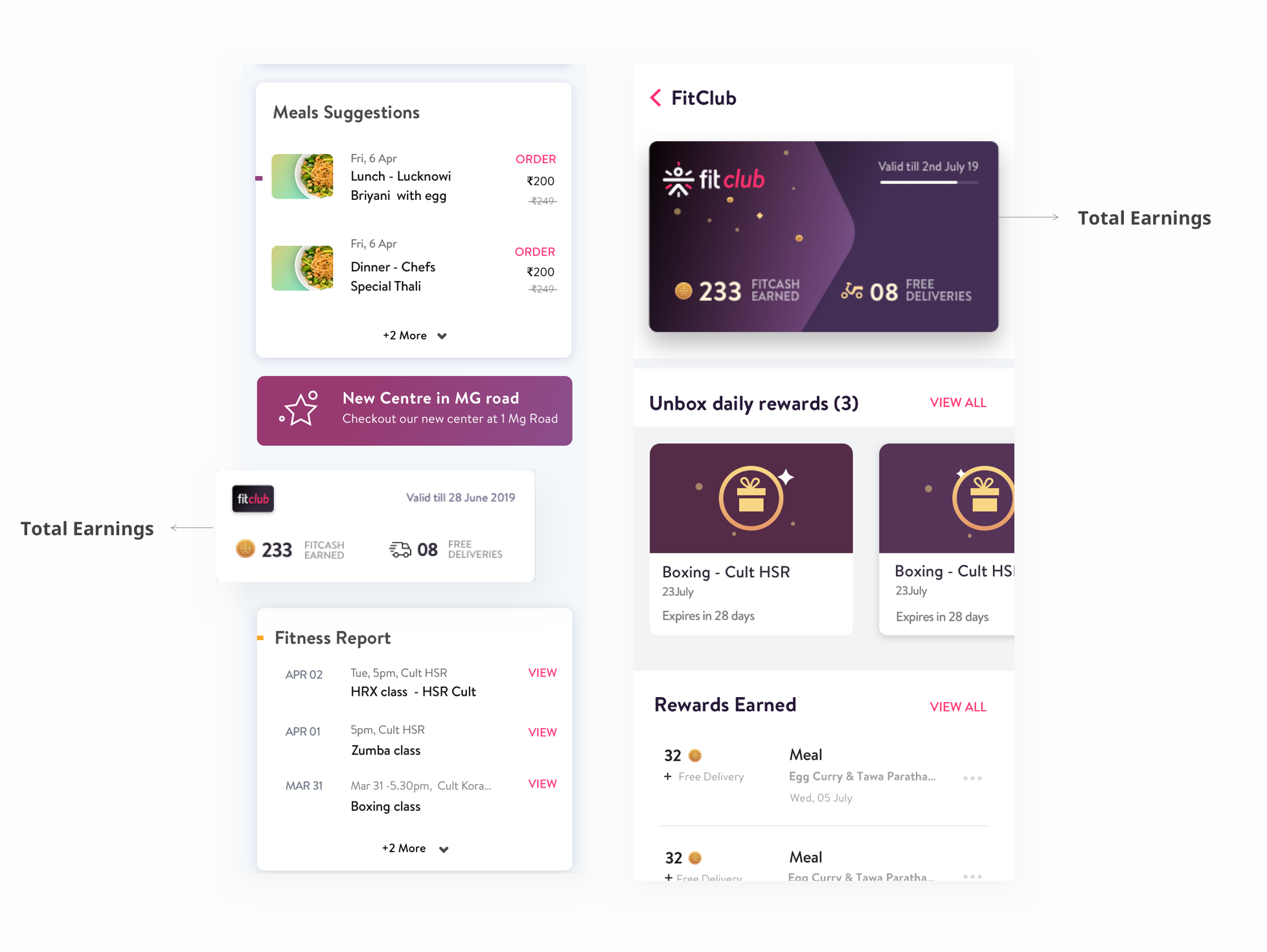
Like any other membership, success and adaptability is calculated by the percentage of users renewing the membership. Savings being a great motivator, is used here to keep the user informed, motivating them to keep progressing.
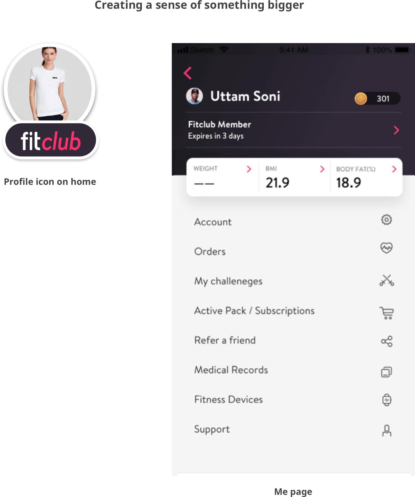
After months of hard work, discussions, debates and several iterations. Fitclub V2 was finally ready to fly. On September 2nd 2019, Fitclub V2 i.e. fitclub for cult and mind, was launched with the media campaign #itpaystobefit. Suddenly whole social media was covered with #itpaystobefit; people enjoyed the experience; it may be the incentives.


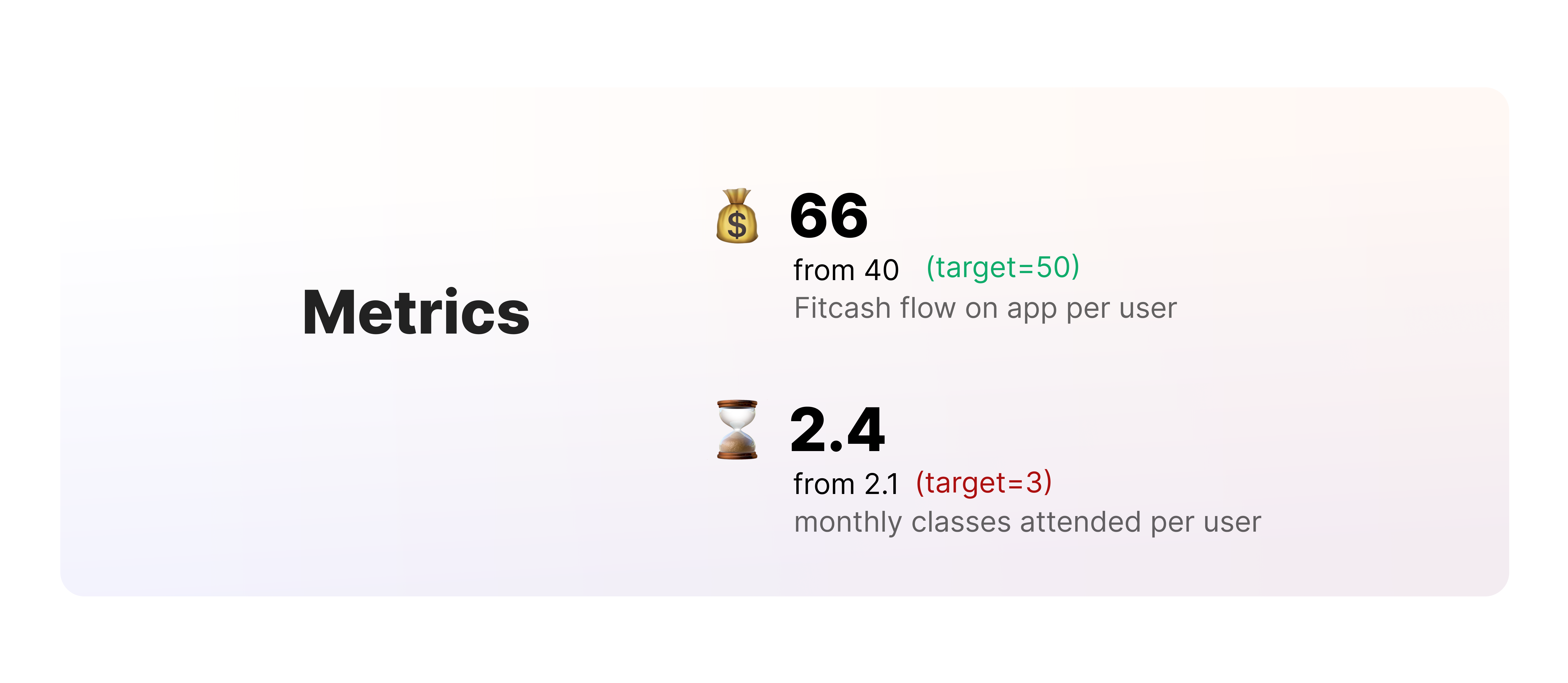
There are a number of game mechanics and gamification elements, but not all work in every case. Users are motivated both intrinsically and extrinsically, but it's our job to find out which of them can be leveraged and which game mechanics are suited in the scenario. This internship has completely changed my mindset about gamification and incentivization.

